Design Portfolio

My name is Corey, and I'm a Chicago-based artist and designer with a passion for creating impactful visuals!
Over the years, I have built my skills through freelance commissions, personal creative projects, and collaborating with local businesses on branding and design projects. My 7+ years in program management and sales operations at Google has provided me with a strong foundation in project management and a deep understanding of operational excellence—a unique skill set that I believe is essential for managing successful design projects. I am eager to contribute my own creative vision and professional experience to a full-time design role where I can continue to learn and grow.
Logo Designs
A local Chicago jeweler and creative that sells custom jewelry and hand crafted accessories.

The logo for a unique and healthy energy drink that gets it kick from spice and natural flavors.

A local Chicago property inspection company that recently established their presence in the city.
Flyers

A pop up museum showcasing staples, icons, and styles from early 2000s hip hop culture.
A refreshed flyer design for a local after school community band program in Chicago.

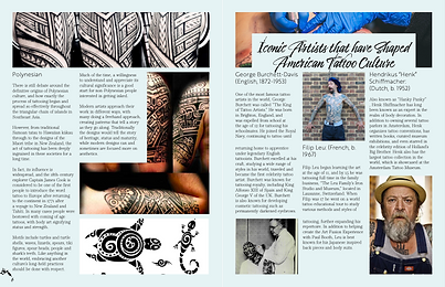
Editorial Design

An editorial project highlighting the history of tattoos and different styles

Amazing Creations
Client Request
The owner of Amazing Cre8tions was looking for a clean aesthetic that captured black femininity and incorporated the number 8, which was a core representation of her brand. While the owner is primarily a jeweler, they didn't want to limit their logo to just jewelry and ensure that their brand can be a bit more flexible.


Design Solution
I made the base of the design to mimic a curvaceous and feminine figure, while also honoring the number 8. The crown is an additional nod at empowering and uplifting black culture, while serving to represent the products she creates. Crowns are a very decorated accessories and way to relate to her business without explicitly mentioning that she's a jeweler.
Shift: Energy Drink
Project Overview
The goal of shift is to expand in a niche market that has been dominated by more aggressive brands. Shift seeks to make spicy energy drinks more relatable and accessible for others that are seeking bold and spicy flavors.
This design was part of a project for certification course where we were tasked with creating an energy drink and developing the branding materials.


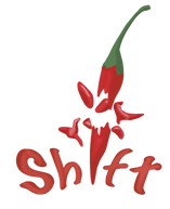

Design Solution
The design is meant to represent bold and spicy flavors by using a bright red chili indicating the level spice. The droplets were incorporated to indicate the drink is still refreshing and bursting with flavor.

Native Property Inspections
Client Request
The owner of Native was seeking to create a very simple and clean logo that demonstrated professionalism. During the briefing process the owner mentioned the desire to show that they are a local and have expertise of the city, hence the name native, and the inclusion of the brand name in the final copy.

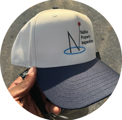


Design Solution
The design we landed on features a CD player which is both a nod to the 2000s era and hip-hop music. Within the CD I added different popular elements and celebrities from the 2000s, representing the playback of that time period. The flyer also contains other smaller elements like TV static to represent channels without programming and the graffiti element in the logo for hip-hop culture and to bring a bit more edge.

Y2k Rewind Flyer
Client Request
Y2K Rewind was a museum gallery pop up and day party that sought to celebrate the 2000s hip-hop culture. The curator for this event was looking for a fun, unique, and energetic flyer that paid homage to the era.
Client Request
The client wanted to refresh an old and outdated flyer for the reintroduction of an after school band program. They wanted to bring more life to the flyer and make it more playful and exciting, while also keeping a professional tone.
%20(1).jpg)


More Designs
Genesis
Logo and Label
This request was from a healthy and natural juice brand that wanted a logo and label design stemming from the theme of spirituality and creation. This is why the apple, a core symbol of the Bible and creation was used. In addition, the label design features leaves and greenery to align with natural elements.


Wedding Suit
Lining Pattern
I was asked me to design a pattern inspired by Puerto Rican staples that would be used for a custom suit lining. I chose symbols that were strong representations of his culture with no set pattern to show movement.


Botanically Modified
Logo and Label
A friend wanted a logo and label for an infused drink that gave a calming, clean, and natural aesthetic. We didn't want it too on the nose that the drink contained THC. The goal was to design something that gave a spa aesthetic.

